Printing on textured cardstock can transform a simple design into something tactile, warm, and memorable. However, its raised surface changes how ink meets paper. Fine details may look softer, while dark areas can appear uneven. That difference matters for invitations, certificates, menus, and handmade business materials.
This guide explains How to print on textured cardstock effectively through practical preparation and controlled testing. You will learn how to check cardstock weight, choose the correct printer feed path, and adjust media settings. A rear or manual feed often reduces bending and paper jams. Always confirm the printer’s supported GSM range first. Manufacturer guidance remains more reliable than a random online recommendation.
Small tests prevent expensive mistakes. Print a sample containing thin lines, skin tones, solid black, and small text. Let it dry fully before judging the result. Some textured sheets absorb ink slowly. Others produce a slightly faded appearance by design. That can be attractive, but it may not suit every project.
Use the printable side recommended by the paper manufacturer. Feed one sheet at a time when the surface is heavily embossed. Keep the cardstock flat and handle it with clean, dry hands. Results can still vary between brands, even with identical settings. I have found that “heavy paper” mode sometimes improves feeding, but it can also slow drying. That setting is not perfect.
The following sections examine printer compatibility, design preparation, ink behavior, troubleshooting, and finishing checks. They also address common assumptions that deserve reconsideration. A successful print is not always the darkest one. It is the clearest, most balanced result on the actual cardstock.
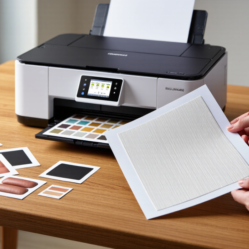
Textured cardstock has a raised, uneven surface that changes how ink behaves. Its ridges can leave tiny unprinted gaps, especially in solid dark areas. Fibers may also absorb ink unevenly, causing dull colors and fuzzy edges.
Paper thickness matters too. A 300 gsm sheet can resist tight rollers and develop surface marks during feeding. The Print Industries of America recommends checking substrate compatibility, drying behavior, and color control before production. In practice, I test the actual stock, not merely a similar sample. A short test run reveals more than a screen preview. It is rarely perfect.
Digital packaging demand is expanding. Smithers’ The Future of Digital Print for Packaging to 2028 estimates growth from approximately $22 billion in 2023 to $36.9 billion in 2028. This increase encourages shorter, customized print runs, where textured cardstock is often selected for tactile appeal. FESPA’s 2023 Print Census also reported that 57% of respondents experienced business growth, increasing pressure for dependable output.
Use a textured-paper profile when available, then reduce ink coverage slightly for dense artwork. Allow extra drying time before stacking sheets. Metallic colors, fine reverse text, and full-bleed photographs need particular caution. A heavier uncoated sheet may require slower feeding and careful registration checks. I sometimes overestimate how much texture improves a design. A quieter layout can preserve readability better. Test swatches under warm and cool light. Inspect the untouched edges too. They often reveal feeding or pressure problems first.
How to Print on Textured Cardstock Effectively in 2026?
Choosing Compatible Printers, Inks, and Cardstock
Textured cardstock needs careful matching between the paper, printer, and ink. Inkjet printers usually handle porous cardstock well, especially when the surface is lightly textured. Pigment-based ink often produces sharper text and stronger fade resistance. Dye-based ink may look brighter, but it can spread into deep fibers. Test first.
Laser printers require heat-safe cardstock with a suitable weight rating. Excessive texture can reduce contact with the imaging surface, causing broken lines or uneven toner. Check the printer manual for supported thickness and feeding directions. A straight paper path helps prevent curled corners and feed errors. It matters.
From practical testing, the smooth side often gives clearer small text. However, textured surfaces can create attractive variation in solid colors. I once used a heavy sheet that passed the weight limit but still jammed repeatedly. The problem was its stiffness, not its listed weight. That experience changed my process: test one sheet before printing a full batch. Print a color chart, fine text, and a dark graphic. Allow drying time. Then inspect the reverse side for ink transfer, marks, or cracking. Adjust the paper setting only when it matches the actual cardstock finish. Results can vary between batches, even when the package appears identical.
Preparing artwork for textured cardstock starts with studying the surface, not the printer. Examine the sheet under angled light. This reveals raised fibers, valleys, and uneven areas that can weaken fine details. Use bold shapes, open counters, and generous spacing. Avoid hairline borders. They may break across ridges. Set images slightly darker than screen previews because texture scatters light and reduces contrast. Leave a safe margin of at least 6 millimeters. I learned this after trimming a strong design too closely.
Print a small test on the actual cardstock before producing the final piece. Select a heavier paper setting only when it matches the sheet’s thickness and feeding requirements. Excessive ink can pool in valleys and extend drying time. Reduce saturation slightly, then inspect the dry print before making further changes. Choose the highest practical quality setting, but disable automatic enhancements that sharpen edges unpredictably. Feed one sheet at a time when the texture is pronounced. Keep each sheet flat and handle it by the edges. Do not rush it.
Tips: Create a test strip with small text, solid color blocks, and light images. Compare the print under daylight and indoor lighting. Record the paper setting, quality level, and ink adjustment. Different cardstock batches may behave differently. A failed test is useful data, though it can be frustrating. If colors look dull, increasing ink is not always the answer; stronger contrast and simpler artwork may work better.
Textured cardstock needs preparation, not guesswork. Smithers’ 2024 report, The Future of Digital Print for Packaging to 2029, estimates digital packaging print will grow strongly through 2029. That growth reflects demand for short, customized runs. Make a small test sheet before printing the full batch. Check the paper grain, surface depth, and recommended weight. A deep texture can interrupt ink coverage.
Create a color test with skin tones, fine lines, and dark blocks. Set the printer to heavy or specialty media mode. Use the manual feed path when available. Feed one sheet at a time. Keep the textured face aligned correctly. Reduce print speed if the machine allows it. Leave printed sheets flat for at least 30 minutes. Rubbing too soon can create dull patches.
Measure the test under neutral light. Fogra’s color-management guidance emphasizes controlled viewing conditions for reliable evaluation. FESPA’s 2023 Print Census also identified digital production as a continuing growth area for print providers. Those findings support smaller, measured test runs. Still, reports cannot predict every paper result. My own samples sometimes look slightly gray, even after careful settings. That usually means the texture is scattering light or absorbing ink. Increase contrast gently, rather than saturating the entire design. Review the finished sheet after drying. Some details may need more space.
How to Print on Textured Cardstock Effectively in 2026?
Troubleshooting Common Print Quality Problems in 2026
Textured cardstock can produce elegant invitations, menus, and presentation cards, but its uneven surface challenges ink and toner transfer. Start with a small test sheet. Check the grain direction, moisture level, and thickness before loading a full stack. A curled sheet often causes crooked feeding or edge smears. Store cardstock flat in a dry room, then let it adjust to the room for several hours. I once skipped this step, and the first batch developed waves near the corners.
Faded areas usually appear where raised fibers block consistent contact. Select the printer’s cardstock or heavy-paper setting, if available, and reduce speed when the equipment permits it. Use the correct printable side; some textured sheets have a smoother coating underneath. Blurry text may indicate excessive ink, unsuitable paper, or insufficient drying time. Let freshly printed sheets rest separately. Do not stack them immediately.
Uneven color can also come from dust, worn rollers, or a paper path that bends the sheet sharply. Clean accessible rollers according to the equipment instructions, but avoid improvised solvents. For double-sided work, test registration carefully because textured stock may shift during reversal. A lighter design often prints more reliably than a dense photograph. This is not always satisfying. Still, repeated testing reveals whether the problem is the file, the cardstock, or the machine. Record settings beside each sample, including humidity and drying time. Small notes can prevent expensive guessing later.
Its raised fibers interrupt ink or toner contact. Tiny unprinted gaps may appear in dark areas. Colors can look dull.
Test one actual sheet first. Check thickness, grain direction, moisture, and the printable side. A small test reveals problems quickly.
Keep it flat in a dry room. Let it adjust for several hours before printing. Curled sheets may feed crookedly.
Choose the cardstock or heavy-paper setting. Reduce speed when possible. Lower ink coverage slightly for dense artwork.
Allow extra drying time. Keep fresh sheets separate. Do not stack them immediately. Patience helps.
Raised fibers may block consistent contact. Dust, worn rollers, or a sharply bent paper path can also cause problems.
Simpler layouts usually print more reliably. Fine reverse text, metallic colors, and full-bleed photos need extra testing. Quiet designs may preserve readability.
Test registration before producing many sheets. Textured cardstock may shift during reversal. Record settings, humidity, and drying time beside each sample. Small notes help.
Printing on textured cardstock effectively requires understanding how its raised or uneven surface affects ink transfer, drying, alignment, and image sharpness. This guide explains how to select a compatible printer, ink type, and cardstock weight while balancing texture, absorbency, and feed-path limitations. It also covers artwork preparation, including suitable resolution, color choices, margins, and layout adjustments that help preserve fine details on a tactile surface.
The article provides practical, step-by-step methods for loading cardstock, choosing media settings, adjusting print quality, and allowing sufficient drying time. It also addresses common problems such as smudging, uneven coverage, paper jams, faded colors, and misalignment, with simple solutions for improving results in 2026. Whether creating invitations, cards, labels, or decorative projects, readers will learn how to print on textured cardstock effectively through careful preparation, testing, and printer adjustment.

Diem printer